Pike Place Market
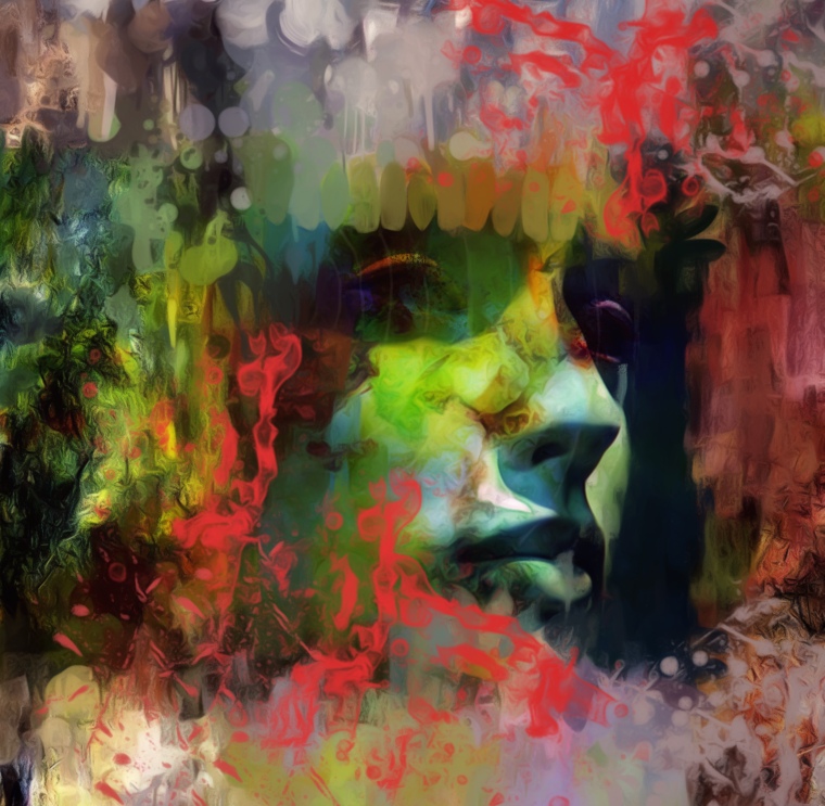
This is a photo of the Pike Place Market. A very famous public market in Seattle. Positively every photographer in Seattle has taken a photo of the front of the Market. But, nobody every drives along Aurora Avenue and nabs a photo of the back of the Market. And for good reason, it’s rather boring. The front of the market is colorful with lots of action going on.
But the back of the market, not so much.
I recently opened a second account on Instagram. I call it @seattle_kerry_style. My reason for opening this account is to give another look at Seattle. I am a medium good photographer. I can’t do the drop dead gorgeous photos of Seattle yet. But, I can do some interesting alternative looks at Seattle like this.
I took this photo into my iPhone 6 Plus. I started in Snapseed which is where I start with all photos. I used the tuneup feature to just get it into shape. A little brilliance, contrast and saturation.
Then I took it into Enlight, which is becoming one of my favorite enhancement apps. The more I use that app, the more I find to use. I started under Image and used Adjust and chose Tools. I went into Basic and used some of the choices there. Then back to tools and into Details. I used structure there. Then maybe into Color to use saturation. I forget. Then, I checked the check mark and chose Clarity. Again, I went to the tools rather than use their presets. I really like the settings in Clarity, although I don’t use the Clarity setting much. I like to use sharpen there, as well as fine, blacks and saturation.
Then when I got what I wanted, I clicked the check mark and chose Target under Image.
This is something new to me and I don’t know if I’m using it correctly. But I like how I’m using it and what it will do.
There are three choices of gradient under Target, radial, linear and mirror. I have used radial. I take the radial gradient and put it over one small area in the photo. Then, I click on Tools. That takes me to settings for the gradient. I then choose Tone. That opens up further settings for the gradient. I choose hue first, then saturation, contrast and exposure. I put them up a medium amount so there is some change in the photo area I have chosen.
Then I click on Tools which takes me back to the gradient shape and I play around with placing it where I like the effect it makes. For instance, I placed this gradient radial to make the purples, the pinks, and the greens in the photo.
Then, I will go back to Tools and play with placement of the gradient, then back to Tone to play with the settings to get what I want.
I keep going back and forth like this until I get what I want in that area.I repeat this several times until I have the photo covered in colors that I like.
Then, I save it and take the photo into the app Procreate on my iPad Pro. In the front buildings that are green and purple that have some grey on them, there was much more grey than I wanted and it was very rough. I thought it looked out-of-place with the rest of the photo. So I took the oil pastel brush under Sketching in Procreate and lightly brushes in those areas to smooth them out and add a bit more color.
I’m new to doing all this. So, I’m probably doing it all wrong. But I’m having fun and I’m liking my results.
What is surprising me, is I thought one needed Photoshop to do all this. It amazes me that I can do it all on either my iPhone or iPad Pro. Digital technology is moving forward amazingly fast. More and more it jumps forward every day. It is so exciting to be on this ride with digital. It’s quite an adventure!