I’ve Seen You Before
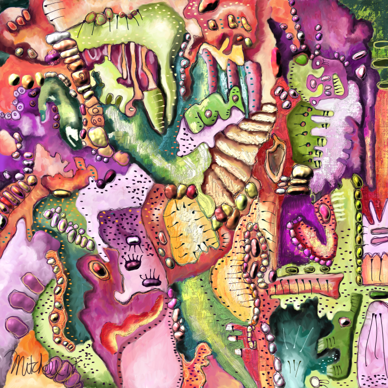
This is a painting that I did in Corel Painter. I promise I won’t bitch about Painter or tech support at Corel. Actually, in Painter 2018, things are going very smoothly. Painter released in this version some stability to the application that seems very nice. They also released for their trick to get you to buy it and/or upgrade a thing called thick paint. They claim this looks like real paint. Well hold it, Corel, what have we been using all these years? Has our paint not looked like real paint all along?
Anyway, maybe this looks more like real paint. I’m just not sure. But boy is this stuff thick. It is like painting with gloop. I initially stuck my nose up at it and said no way am I painting with this stuff. Not only because it was gloop but because it has its own separate layer. It has a separate layer that does not act like a real layer. So it is isolated. It will not do many of the things a layer should do. Plus the brush engine for the thick paint has a lot of controls to figure out.
In the past, Corel rolls out its latest trick brushes and then the next year it acts like it never heard of these brushes. You are left holding the bag as to these brushes. Well, why should I learn the complex brush engine of these brushes if Corel is just going to move on to some other trick brushes next year?
Eventually, when I took Skip Allen’s Introduction class, I came to love the brushes Skip made and I used some of these brushes. But, I’m holding off judgment on them. I’m not embracing them yet because I’m concerned Corel will not develop them further in the future. For example see the Dynamic Speckle Brushes that were developed a couple of years ago. They have great potential. But still need some tweaking. Hello, Corel, are you ever going to tweak those brushes? No. The program is full to the brim of brushes that need a tweak here and a tweak there.
Anyway, I bitched about Corel Painter. I guess it’s the best thing out there, but they sure can make a person angry with their shortcomings.
This painting I did with my thick paint brushes that I was in the process of making before I knew Corel was going to come out with thick paint brushes. I started working with the impasto brushes to see how thick I could make them and have them look like real paint.
In the impasto control panel you can pick the depth method. It is right below the Draw To box. The Draw To box is where you pick Color and Depth for impasto. I swear I have never noticed the Depth Method box before. Probably because the print is so small and there are so many options in Painter. There is always something new to discover.
Anyway, I started using Paper for Depth Method and it opened a whole new world in Impasto. Wow!!! I have a huge collection of papers that give me lots of different depths. But even if you don’t, just using Painter’s default papers give you a huge variety of textures. This is especially true if you adjust the contrast and brightness to the paper. I take the contrast up and bring the brightness down usually. I believe that Painter reads the dark areas of paper. Or else it reads the white areas. But, I’m pretty sure it reads the dark areas. But experiment for yourself if you need to actually know. The other adjustments you can make to the paper are the paper scale which can be very important. Then there is an adjustment for rotation which can play an important part. Then new to Painter on the grain setting is the Random Grain Rotation setting and the Random Grain Position setting. I really like the first one. It makes your strokes on a piece of paper look very real. Without this setting, you are just repeating a digital pattern.
Be sure to have Grain Expression set to pressure. Then, and this one I consider essential, be certain that you have set the Brush Calibration for the individual brush. I think it is essential to do this. There are many that believe that global brush calibration is ok. That just is not true, in my opinion. Set Brush Calibration for every brush. It makes a huge difference.
I painted this picture with some of my new impasto brushes. While I was doing that I started goofing around with Liquid Inks. I then remembered that if you went into the layer settings for Liquid Ink, it would cause the Liquid Ink to become thick and raise up and become 3D. Wow!!! Awesome!
OK, Painter really is an awesome app!!!! It does some awesome things.
So then, I decided, I would have to add some of the thick paint that I wasn’t liking so much. So grudgingly I put some on here and there with the fabulous brushes that Skip made (see my earlier blog for information on the Intro Class to 2018). All in all, this was a really fun painting to do.
Oh!!!! I have to tell you, I have fooled around with this painting since 2014! I have repeatedly tried to paint it with nothing but failure! But I got it out this time, now in 2017, and it just came together. So, never give up on a painting, no matter what.
If you are interested in my brushes and want them, drop me an email.
Kerry

Hi Kerry – love your image! I am also finding in PS that images I was not pleased with before are now working out much better because of the new technology. Still struggle with Painter though but keep trying. Looks like you have a really good handle on all the new things in Painter.
LikeLiked by 1 person
Thanks Syd! I’m so glad you like the painting. New technology is definitely helping!
LikeLike
Hello Kerry! You seem to be some measure of stress with Corel whenever you talk about it–a kind of ‘approach/avoidance’ conflict, so I’m happy they are at least giving you a lot to experiment with. That was a long haul with this particular painting, but it seems you’ve really mastered shading (is that through the layers?) and as a result, it really does look like real paint, so congratulations.
Do you get much conversation going among other Corel users?
Hope you’re well on all fronts. Carole keeps me up to speed on how you two are doing, but it’s largely in thumb-nail narratives :).
Wish you could see the snow-scape here, and especially what’s happening on the lake–it’s actually boiling as the heat escapes the water. The ‘steam’ escapes in bursts of vertical columns and it roils the surface of the water, and when the wind is also up, the waves get ‘broken’ and clash with one another. It’s actually violent. As I talk about it, I wonder about how a painter would render it. Does Corel Paint handle white images well (snow, fog, steam)?
Thanks for sharing your work again 🙂 Jerre
On Sat, Nov 4, 2017 at 2:41 PM, Kerry C. Mitchell’s Adventures wrote:
> Kerry C. Mitchell posted: ” This is a painting that I did in Corel > Painter. I promise I won’t bitch about Painter or tech support at Corel. > Actually, in Painter 2018, things are going very smoothly. Painter > released in this version some stability to the application that seems” >
LikeLiked by 1 person
Hi Jerre, Yes Corel has a huge application. It’s the equivalent of Photoshop, but it paints. It’s full of things that it does. But it’s also very old, so it has old code so it can be very buggy. But they are cleaning it up. Painter can paint whatever you want. It also can be used to process photos and has several processes dedicated to just photos.
LikeLike